"You know you can turn your camera, right?"
A while ago someone said to me: “You know you can turn your camera, right?”
I hadn’t really thought about it, but it is very true that almost all of my photographs are landscape instead of portrait. The two abnormalities in this case are the two giant prints of New York city that hang in my living room.
In the years after this statement I started to pay attention to this habit and I started to analyze why I prefer to create horizontal images.
First of all I noticed that the camera feels much more natural in my hands when I shoot horizontal. I would even go a step further and claim that this way the camera feels like a part of myself. When I put the camera in front of my eyes and look through the viewfinder it feels as natural as squinting your eyes in direct sunlight.
Secondly: to me a horizontal photographs feels more natural. The narrow shape of the vertical photo might draw attention to a human or animal portrait beautifully but when it comes to nature I often feel like the sides are two walls that prevent you from seeing the rest of the story.
Last but not least, a horizontal image gives me a calmer and more balanced feeling, even when the composition itself isn’t. Strange, right?

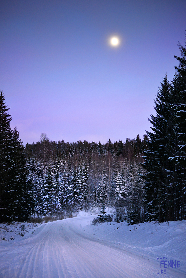
This image of a winter landscape with the moon is vertical (yes, found one!) but I have to admit there was a very specific reason for that: with my prime lens I couldn’t fit in both the road and the moon in a landscape shot, haha- it’s true 🙂

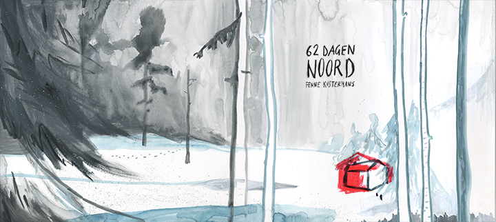
When I started to realize why I had thing thing with horizontal images, I noticed that in my drawing I developed something alike. I love to create book wraps with images that go all the way around. In my last 2 books I have illustrations that go on over several pages- but with some you don’t even notice until you see the original artwork.

For me, letting a drawing or painting develop over several pages, gives a certain freedom to time and space. Suddenly the thought that are represented in colors and shapes are free from the sharp papercuts of edges. The moment continue, the thoughts go on, even when they fold around the sharp corners of a page or a book cover.
Does this make sense?
Perhaps not.
But for me it works 🙂
Wish you a pleasant and artistic weekend!